Origins Design
Tagline development & web design
BACKGROUND
Origins Design is a family-owned, high-end bespoke furniture maker with cabinetry, upholstery, metalwork and finishing services all under one roof, operating in London.
Origins Design are part of the Camberyard Collective and as such tapped into our expertise in brand development and web design. They first needed to take stock of who they had become, and begin to articulate their vision and position for the business, before we could embark on redefining the look and feel of their new website design.
BRAND JOURNEY
By taking Nicole and Patrick through the full discovery process they were empowered to articulate their story and be comfortable with the words and language that we all agreed best defined them. The brand facets were then brought together to reflect their new positioning and tagline.
It is not always necessary in a branding project to alter the identity, here was a case in point. Their identity was still fit-for-purpose after our review, we just needed to update their generic strapline for something that more easily defined them.
“We were recommended the services of Zeke Creative by Polly at Camberyard to help us navigate the changes we needed in developing our brand. The first step in the process was a Brand Discovery session—this was so helpful to us. It gave us a better understanding of who we were; how we operate and has given us the right language, direction, and confidence when commissioning copywriting and photography. Zeke Creative were a pleasure to work with, delivering a more relevant tagline and a beautiful new website for us.“
Nicole Moulton Black Director & Co-founder
WEB DESIGN FOR FUNITURE MAKER
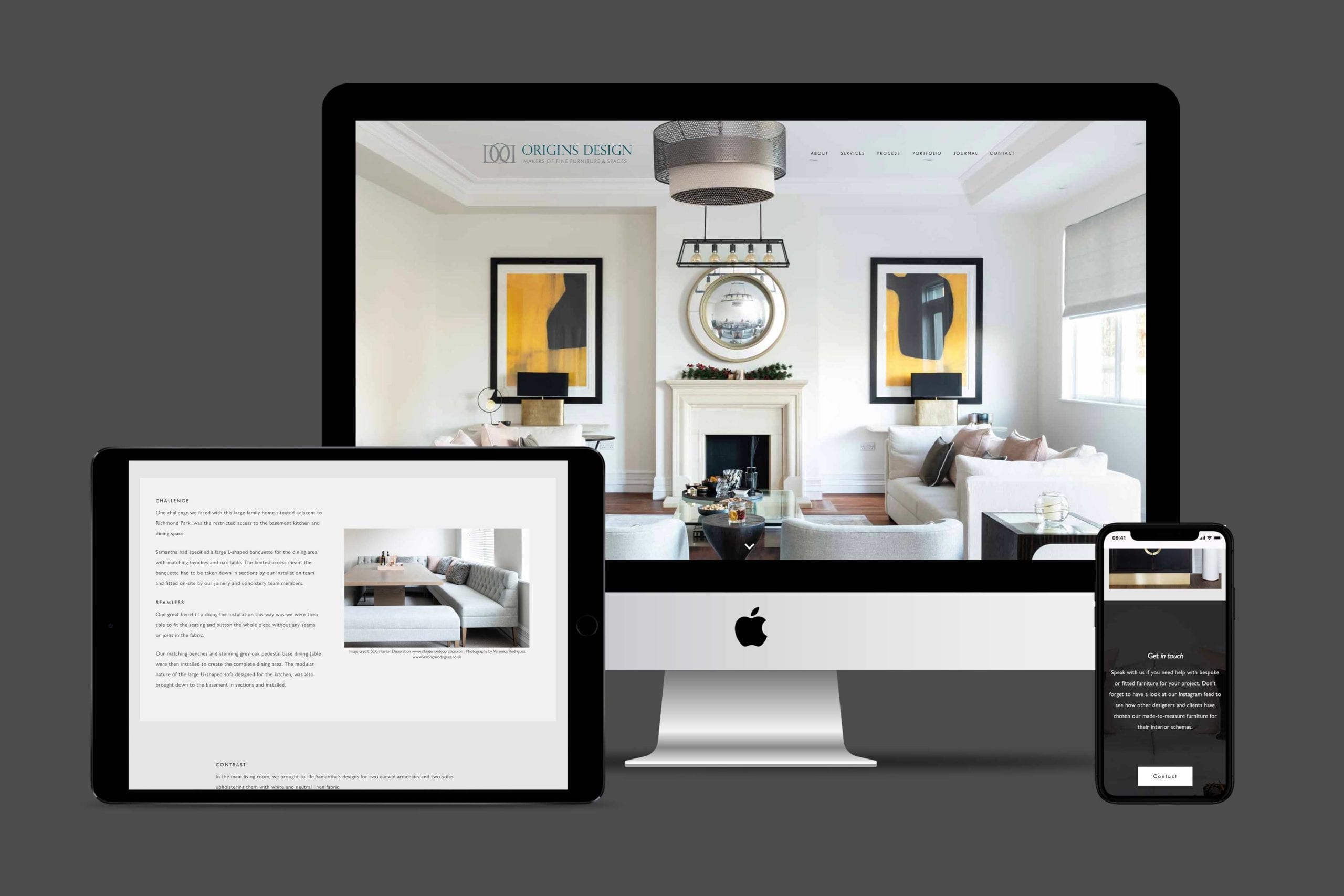
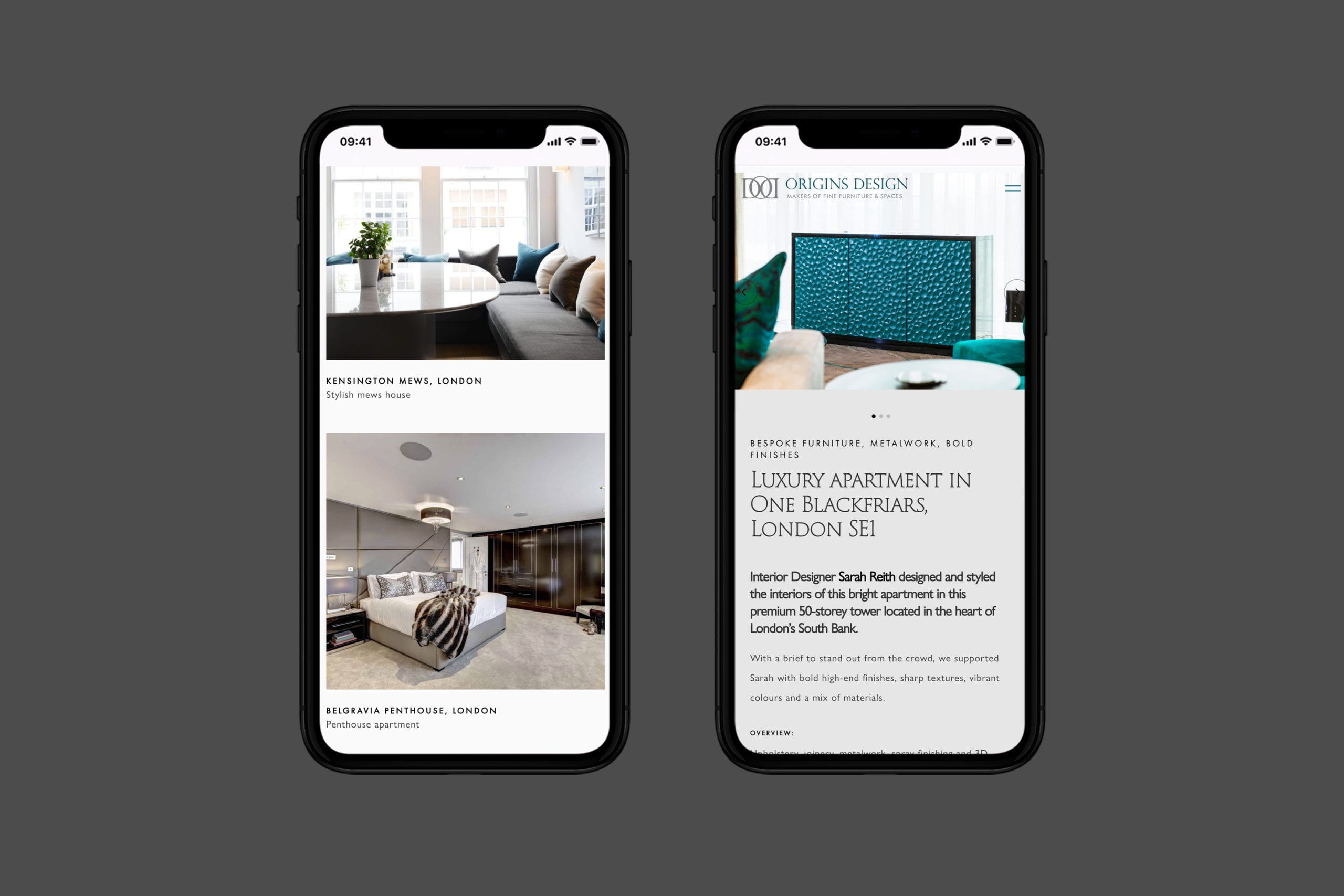
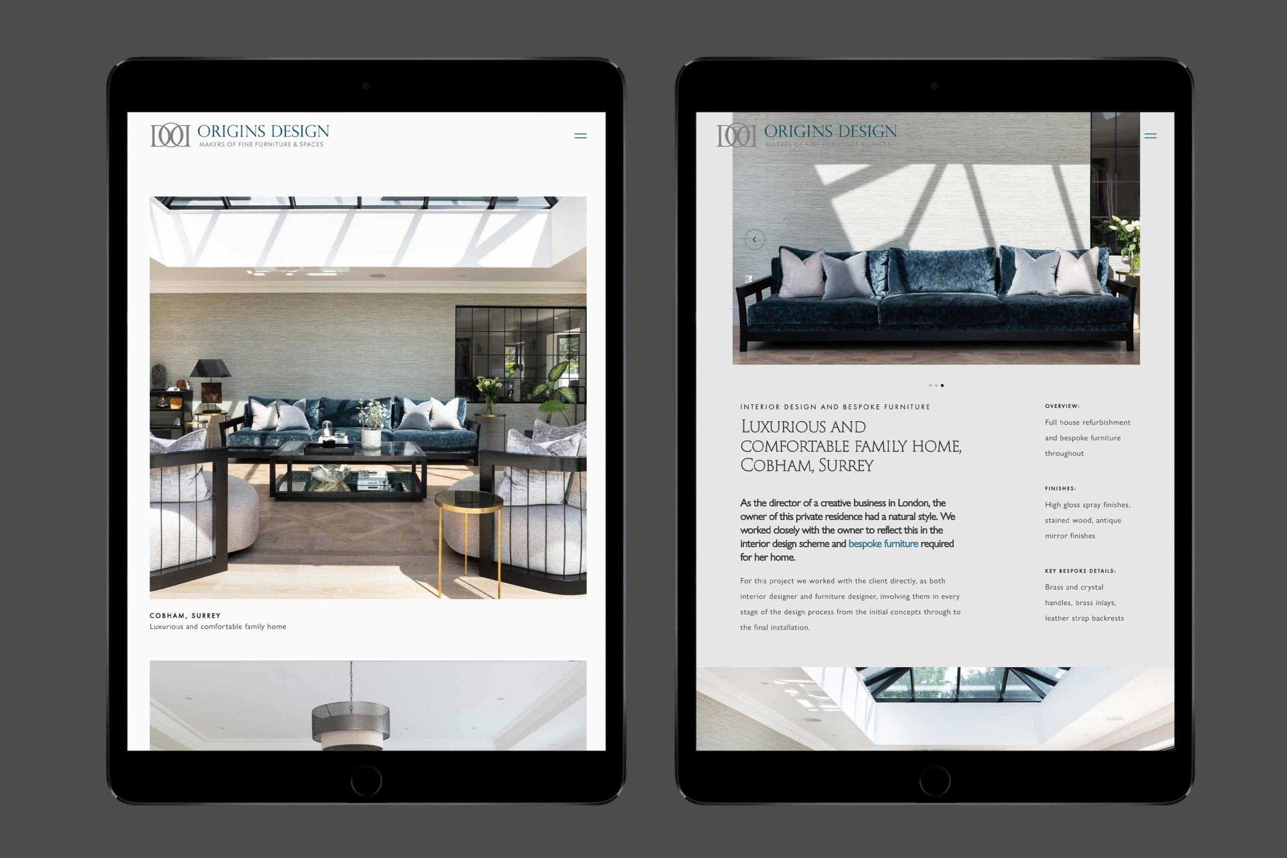
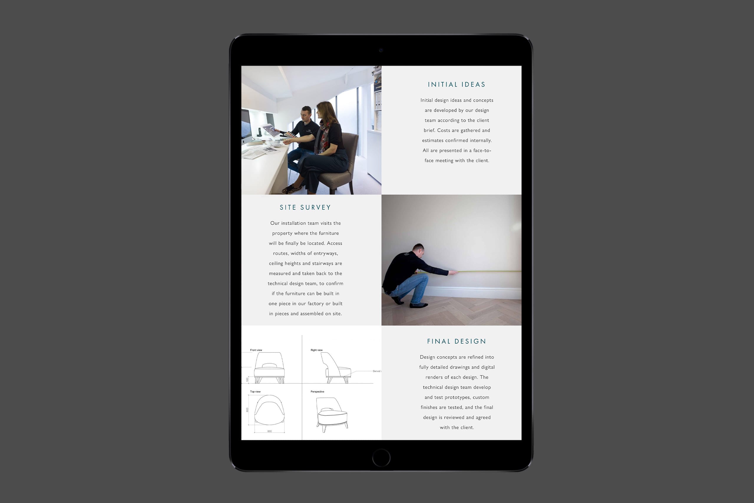
We were able to write a brief that informed the look and feel of the new website. Origins Design commissioned new studio photography and sought assistance with crafting the right messages with a copywriter for the web project. The WordPress platform was chosen and a customised theme was developed.
Futura was chosen for the navigation and fine small titles to reflect the font used in their new tagline. Large display text was specified with Trajan, acknowledging the need for consistency with their core logo font. All secondary text used Gills Sans – a timeless classic.
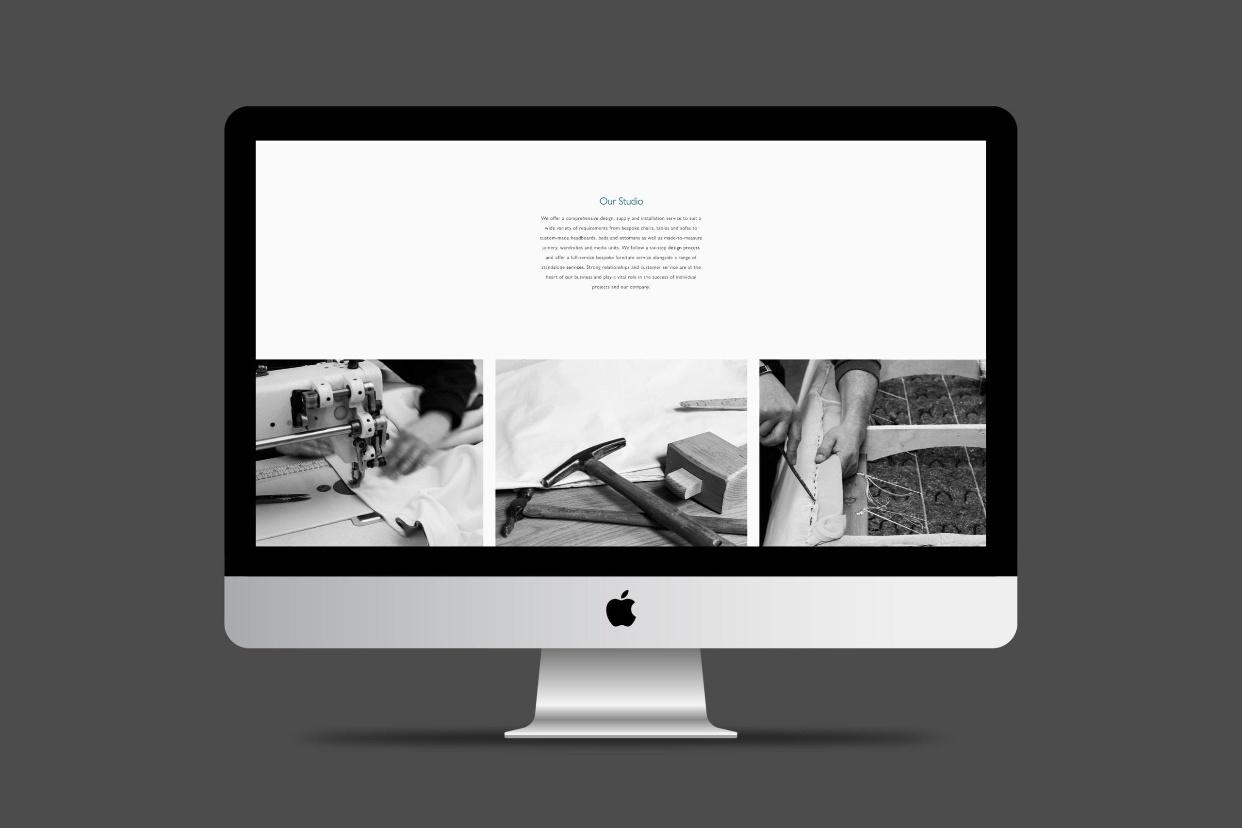
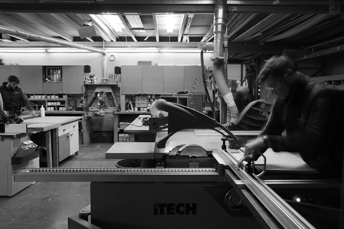
While project photography utilises full colour photography, we chose to use black & white photography for the studio and craftsmanship pages. The design layout made good use of space, appropriate subtle colouring and sharp imagery, the functionality of the website should is slick, engaging and easy to use.
KEY SERVICES
- Brand Discovery workshop
- Brand Strategy
- Art Direction
- Design
DELIVERABLES
- Tagline development
- Responsive website
Get in touch
Find out how we create web design for furniture makers and interior designers. Give us a call, drop us an email or just pop by our studio.
