Blum
Brand Expression
BACKGROUND
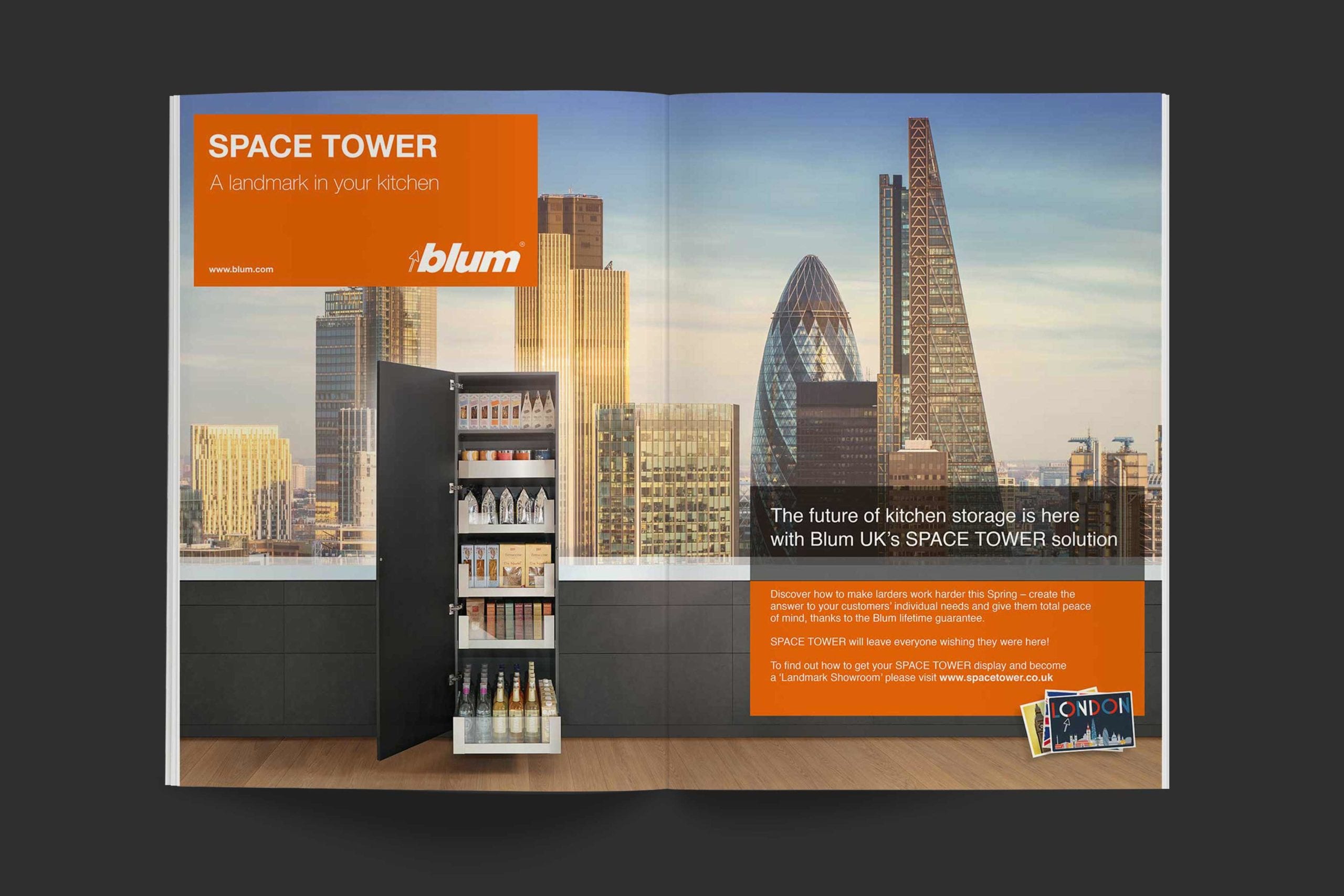
The ultimate solution for larder units, Space Tower quite literally takes kitchen storage to new heights.
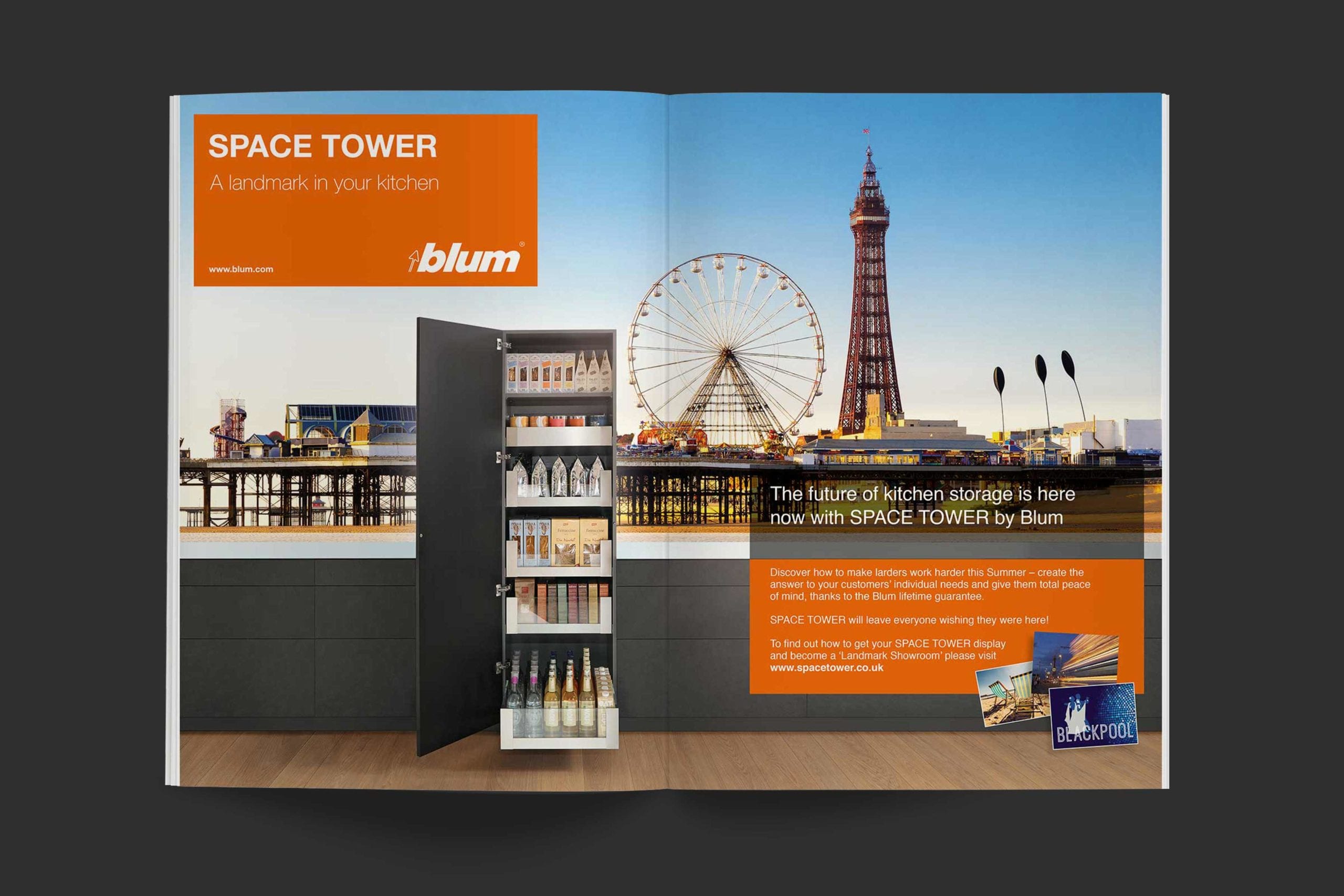
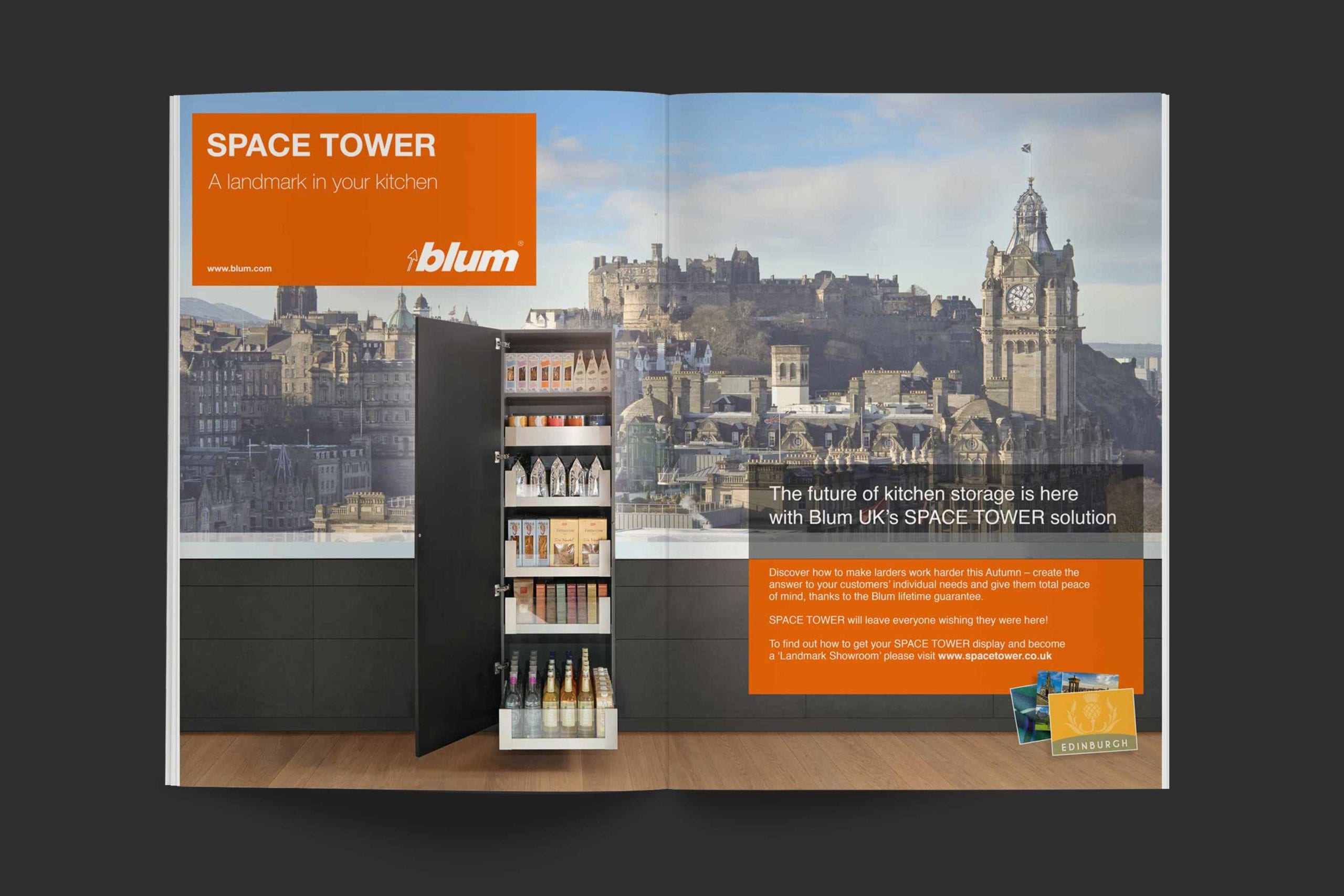
Creatively we could see that this presented an interesting challenge – the cupboard that’s actually a set of drawers. Our answer was to build a powerful visual theme around well known places in England, Scotland and Wales. It had to be a campaign with mileage to grow throughout print media and online for at least one year.
We invented the notion of Space Tower becoming a ‘Landmark’; its imposing physique appearing in diverse locations from Blackpool to Bishopsgate. The result was effective trade press exposure and social media activity which saw people sending in their own landmark images.
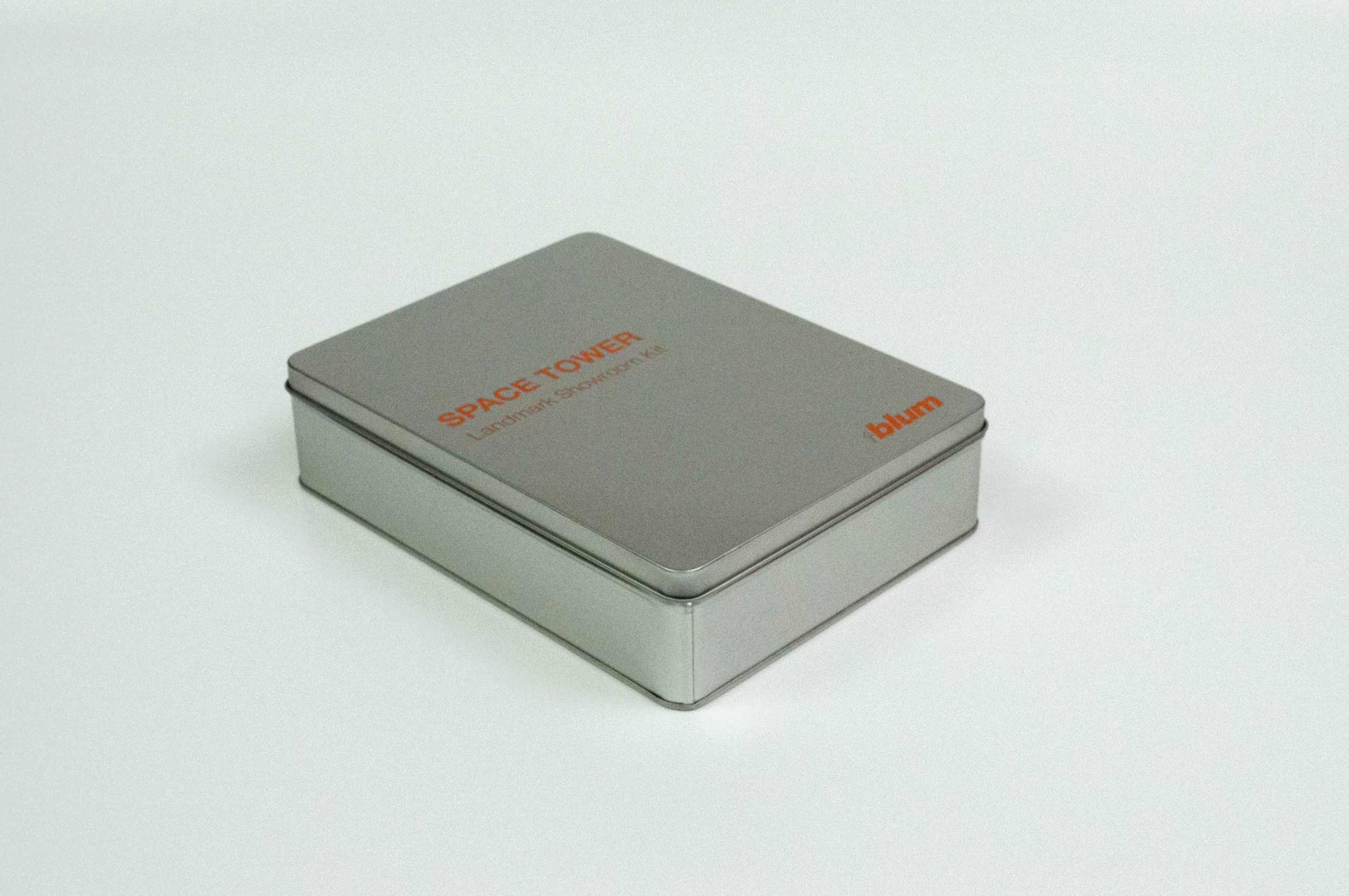
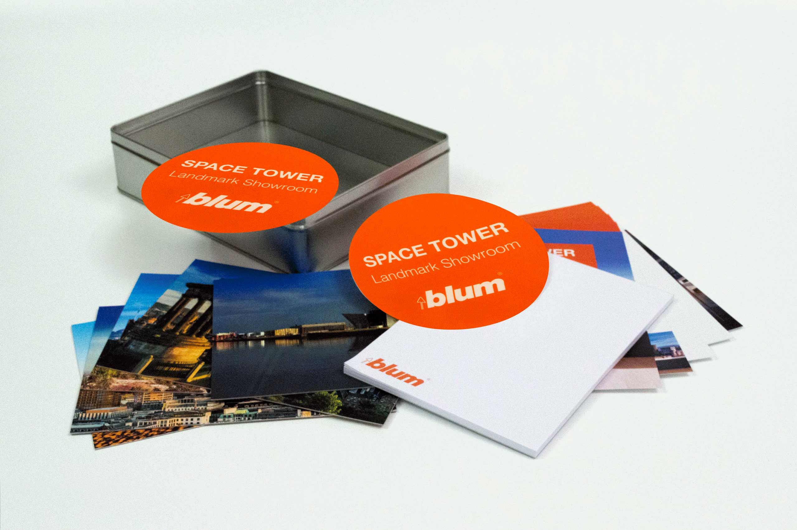
Implementation of the campaign across the independent retailer network was achieved with a handy kit – a pack of support collateral and promotional materials all contained within a branded tin box. One of the main components was a window sticker which allowed any site proudly displaying it to be identified as a ‘Landmark Showroom’.
David Sanders Marketing Director

POSTCARDS & TEA PACKAGING
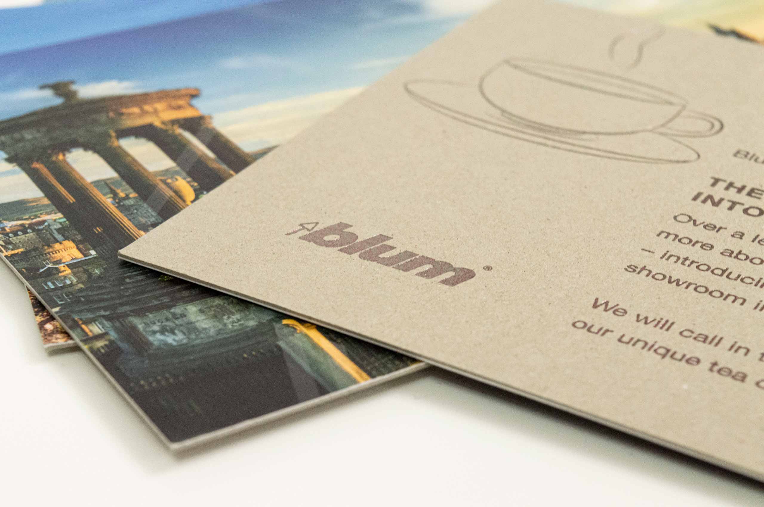
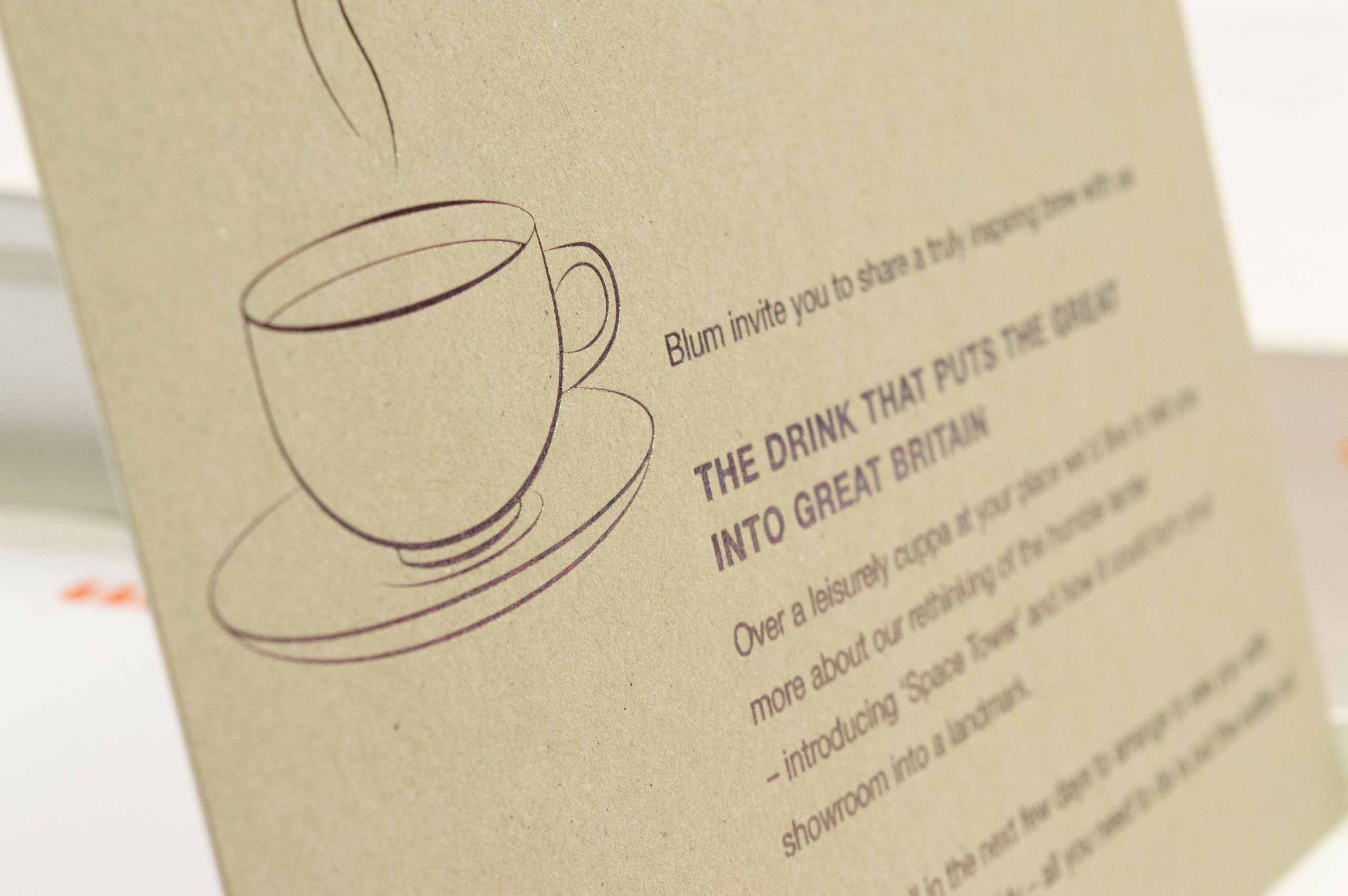
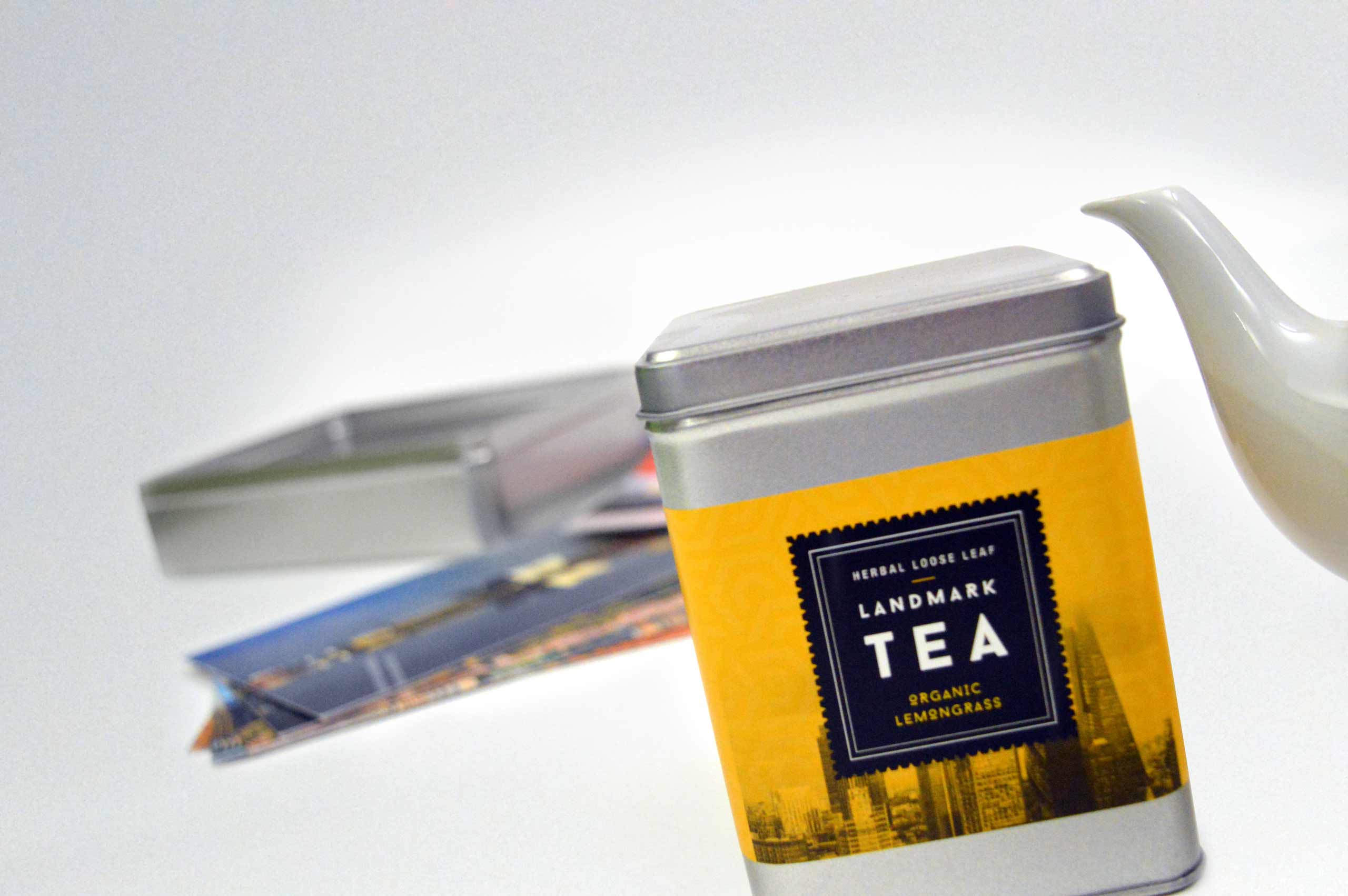
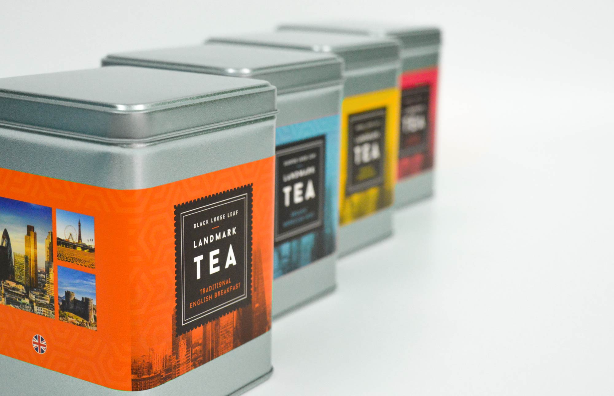
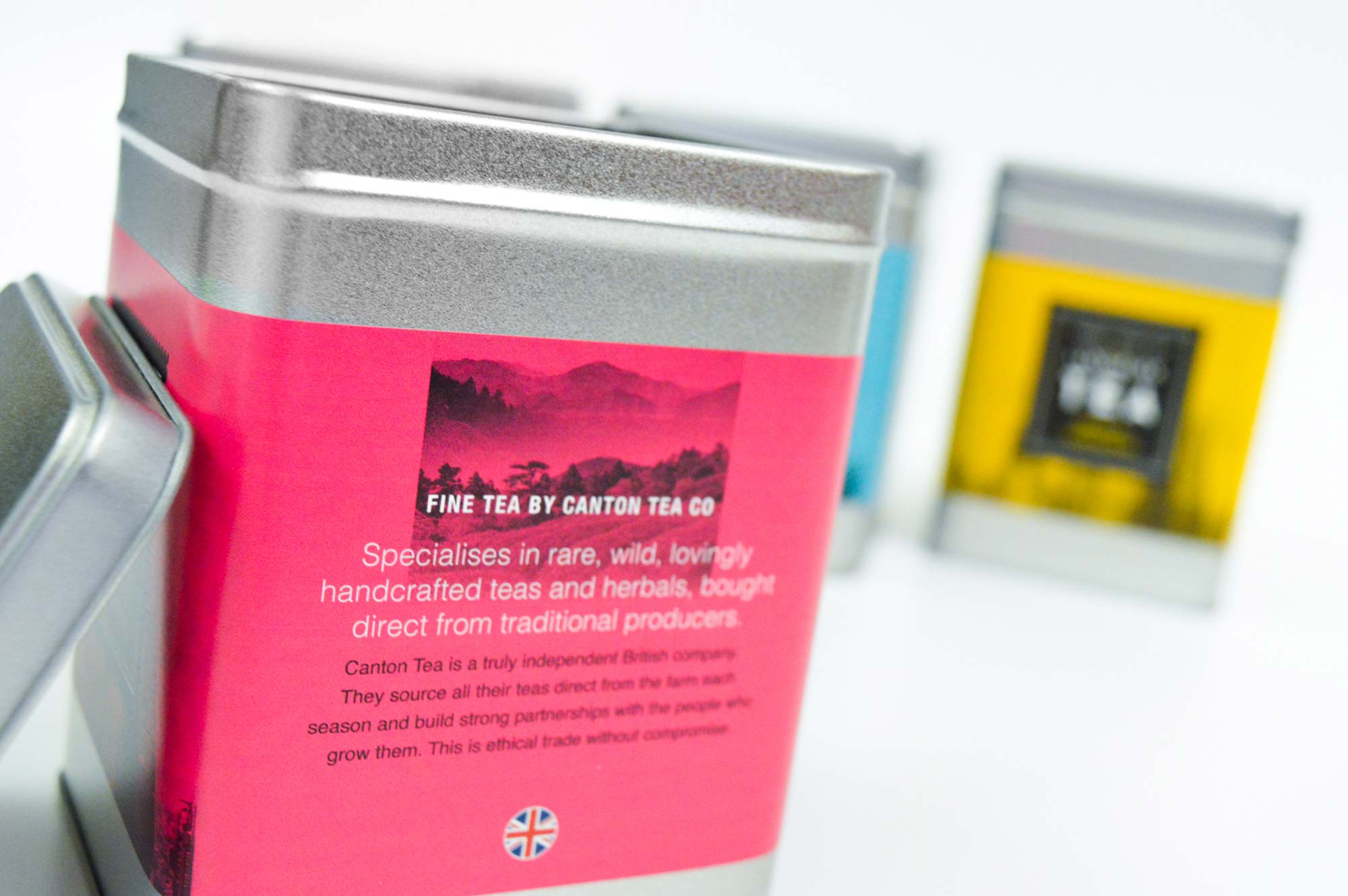
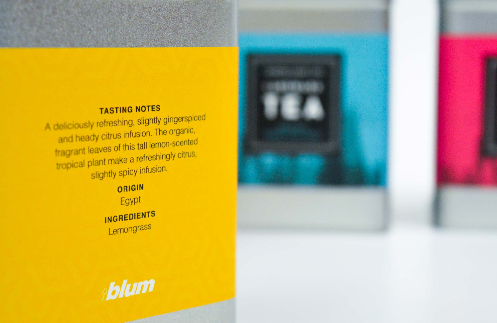
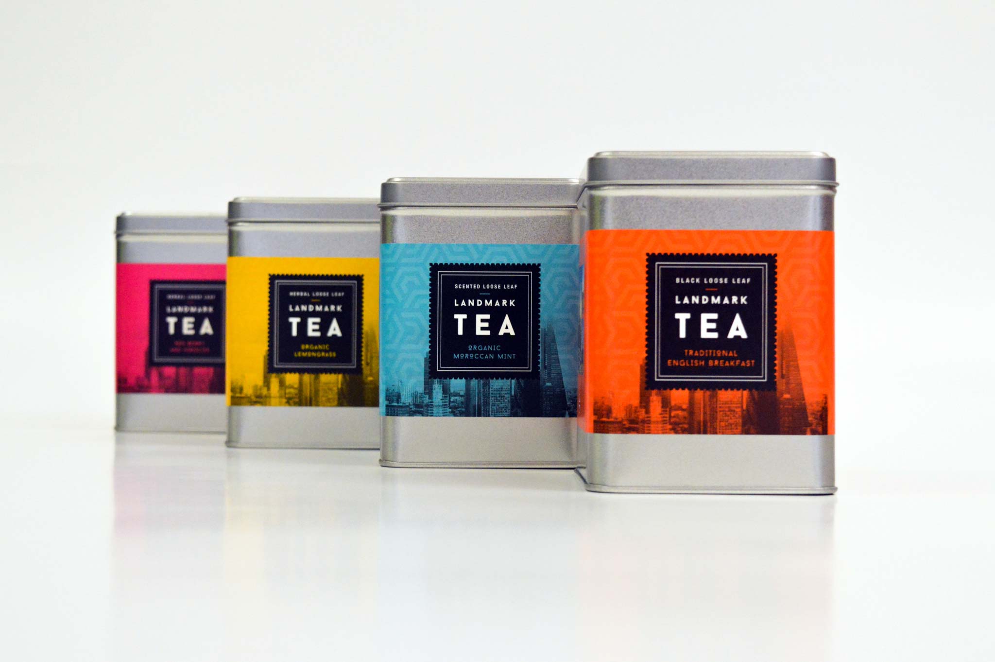
Customer account managers were tasked with disseminating the good news about Space Tower and to aid their endeavours we conceived a scheme to reach out to prospects. The idea revolved around an invitation to take tea together, using a dedicated postcard and fulfilment with specialist loose tea in unique packaging for the face-to-face appointments. The striking family of tins were also valuable as part of the in-store merchandising mix.
BACKGROUND
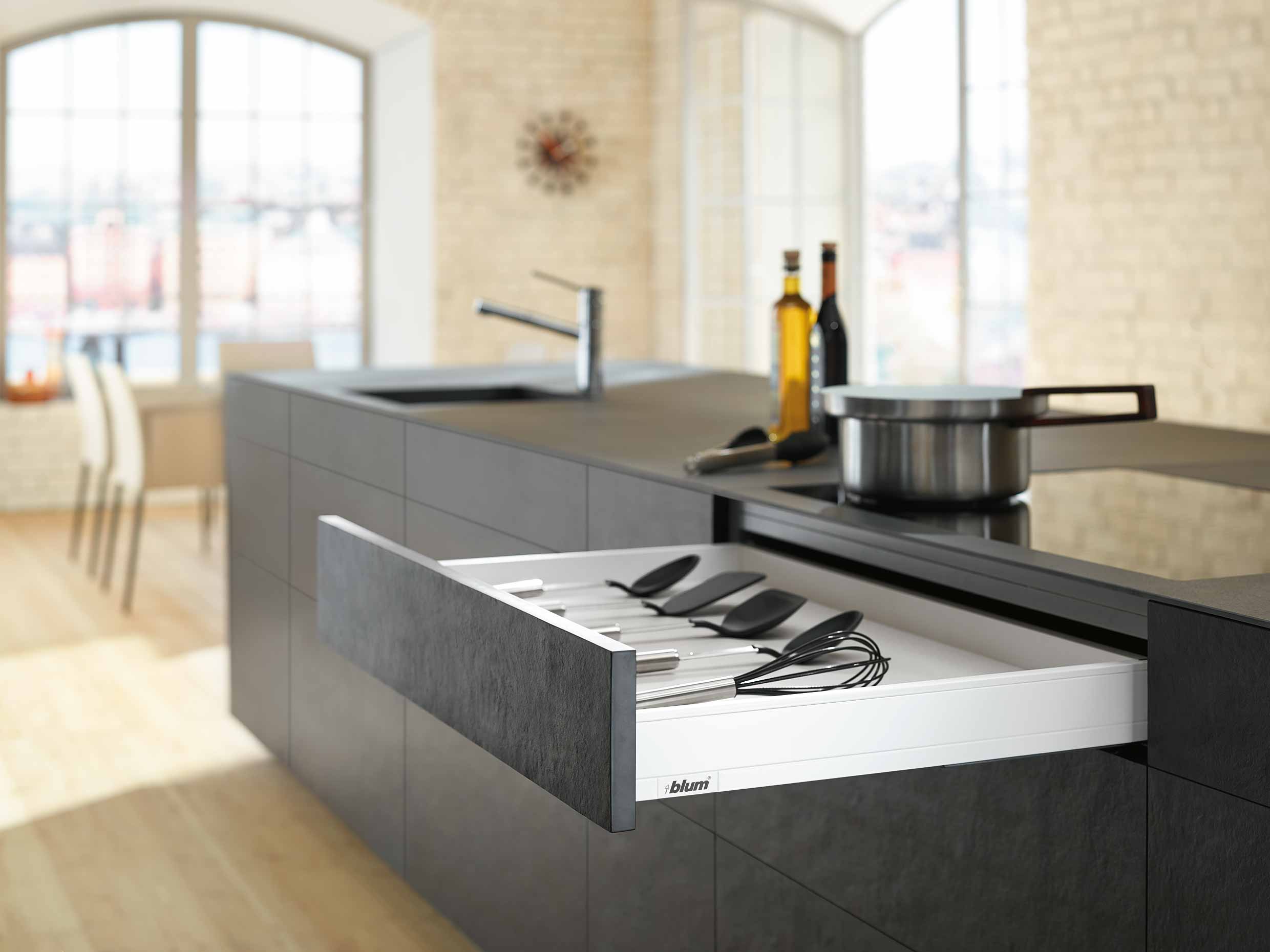
Legrabox is a fresh way of thinking about drawers; a new approach that’s been driven by real customer insights.
Globally Blum encourage users to ‘Experience Elegance’ with this range of drawer solutions. We recognised that for a UK audience they needed to take another stance. Building on the equity of an earlier initiative, that urged trade partners to ‘Think Differently’, we adopted a similar call to action and a sense of looking at things with a new perspective.
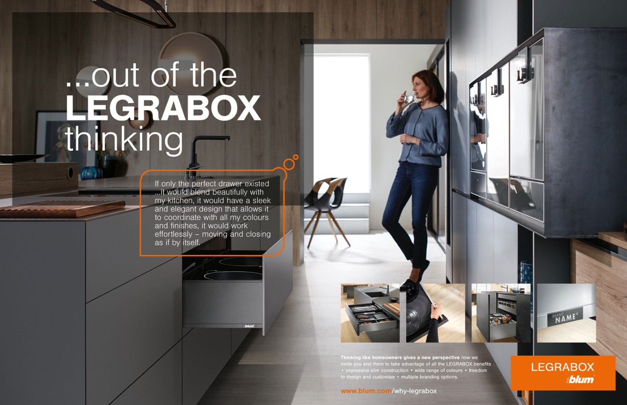
Our message ‘Think outside the box’ was designed to appeal to the type of retailer who welcomes innovation and only wants to deliver the best to their customers. The linear, sleek and slim styling of the box system gave us a wealth of room setting and detailed imagery to apply in advertising and literature to underpin the brand promise.
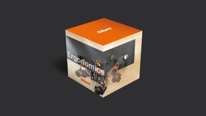
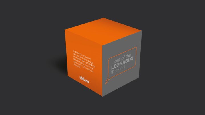
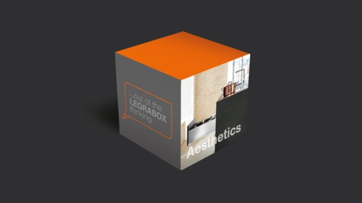
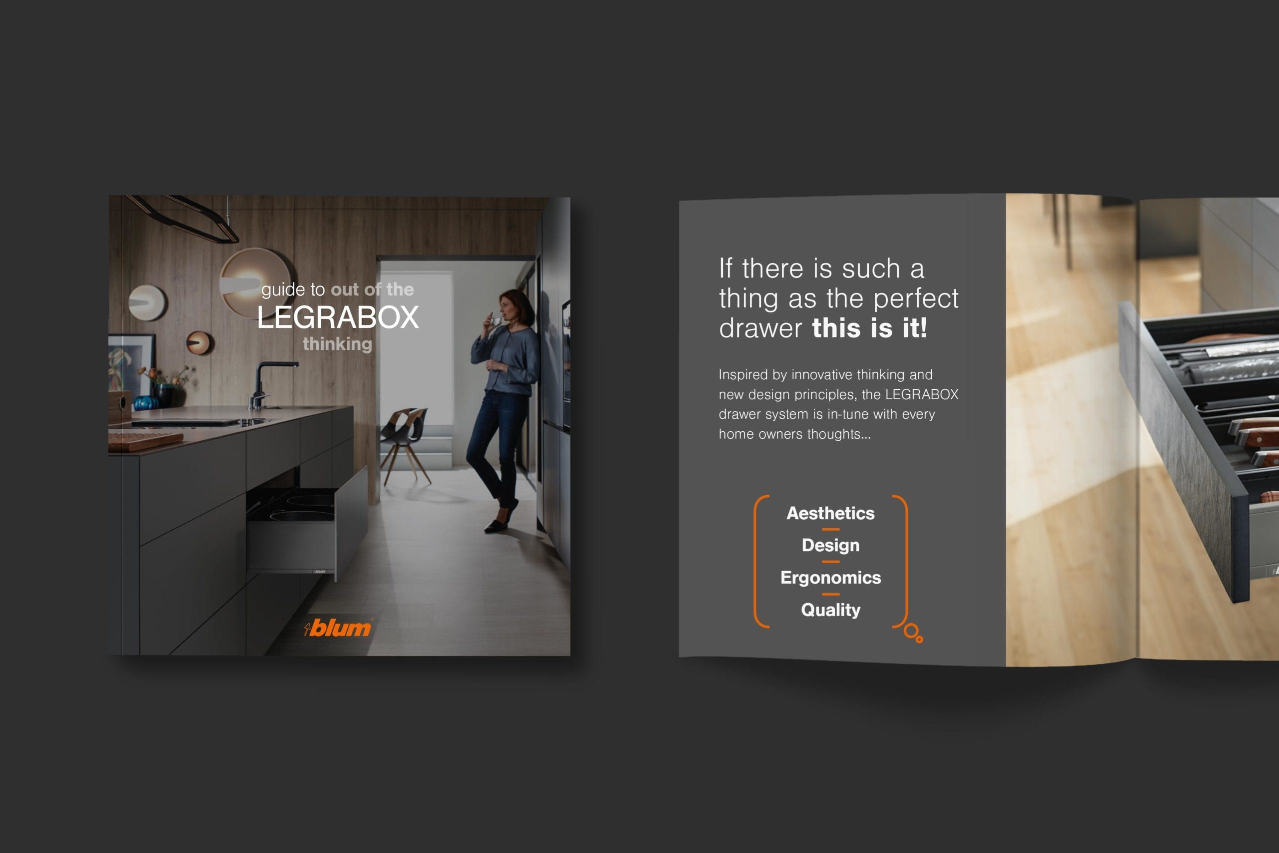
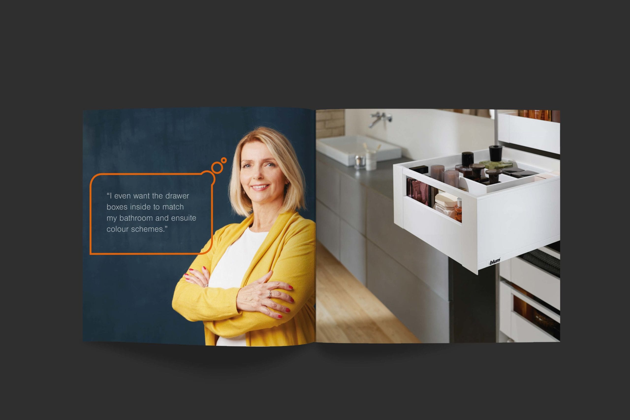
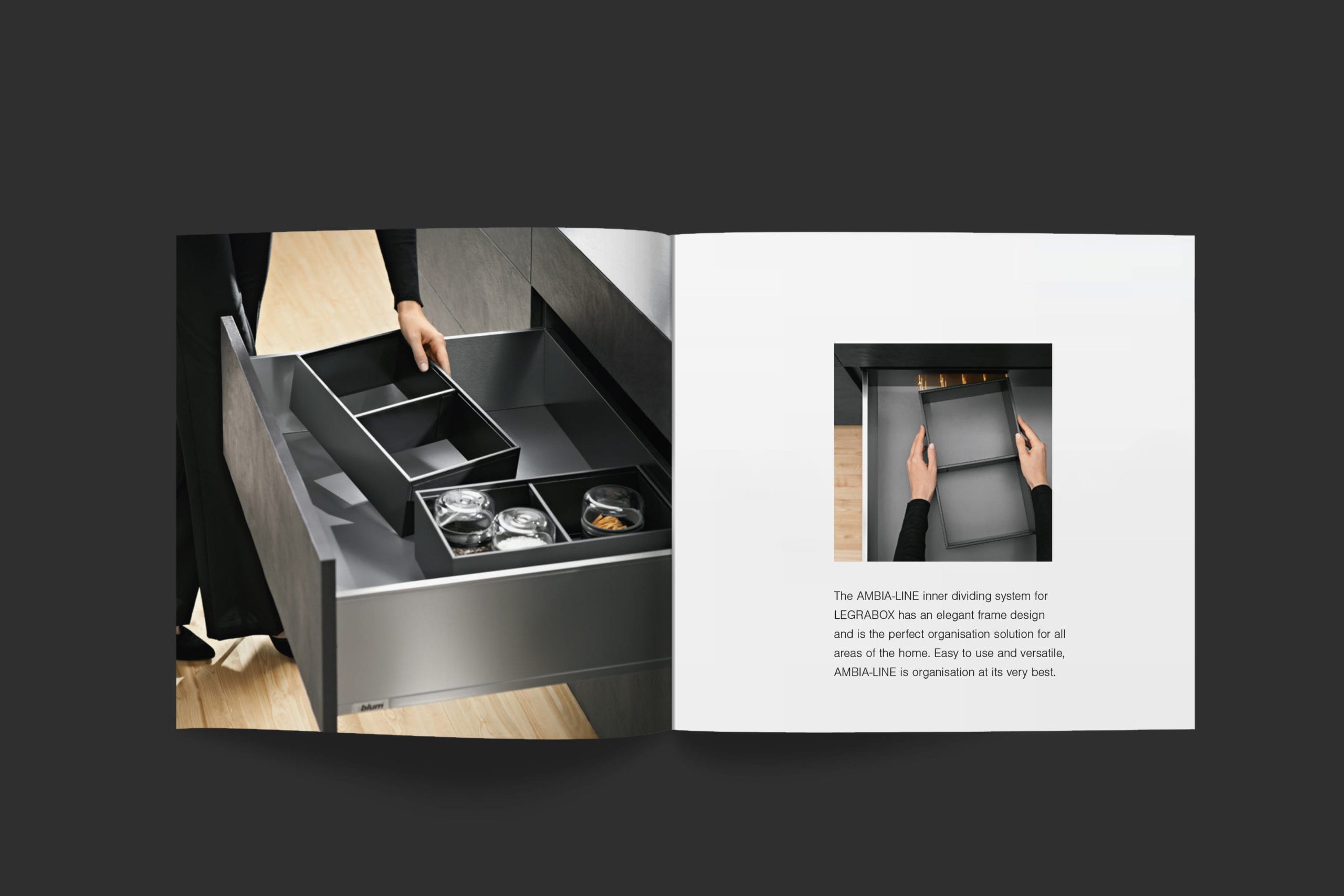
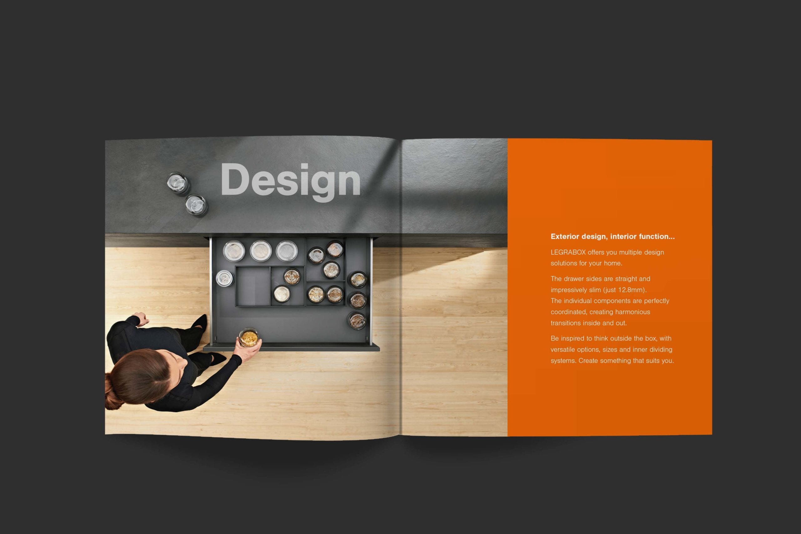
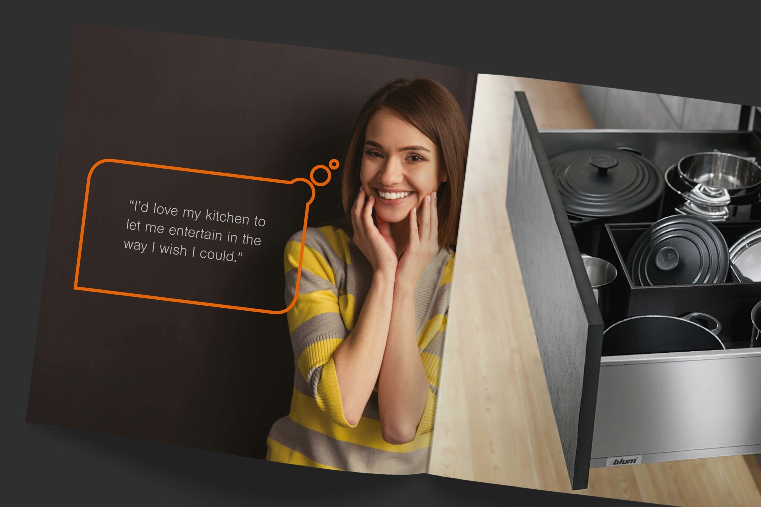
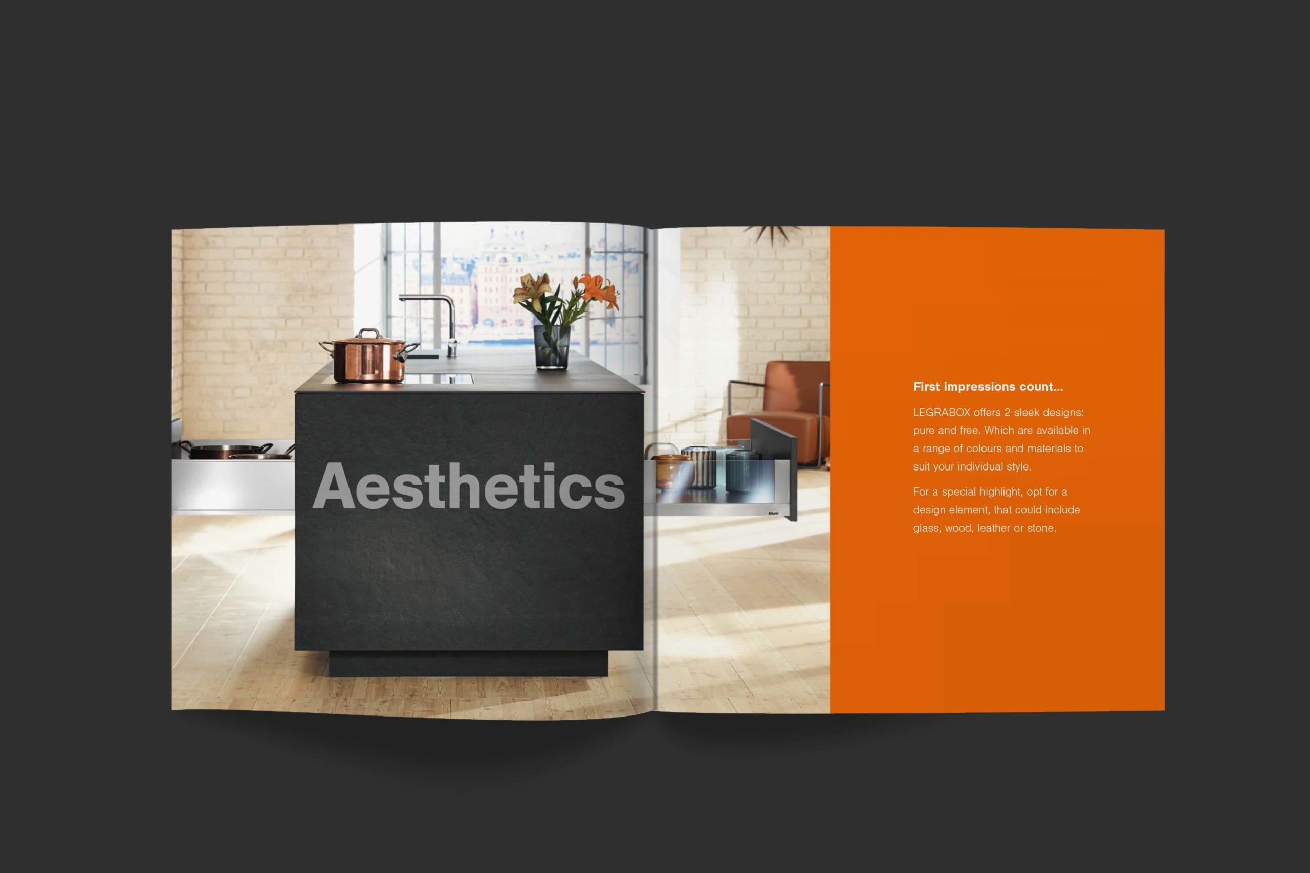
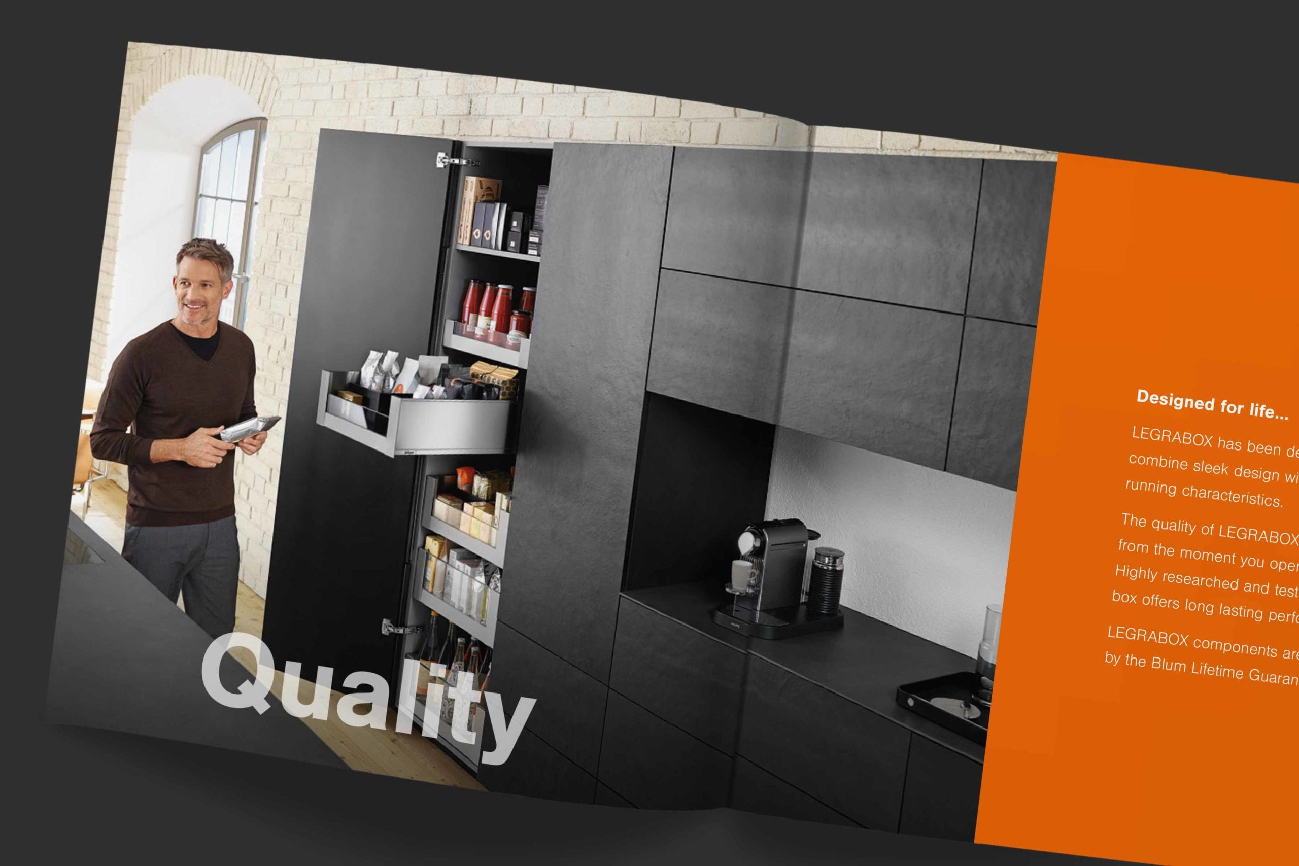
To spread the message of adaptability and proven performance we created a neat pocket book. This ‘Guide to out of the box thinking’ features people drawn from different consumer groups. Each describes a key need that the product fulfils. In turn, the four pillars of the Legrabox proposition; Aesthetics, Design, Ergonomics and Quality are featured throughout sections of the book. The same principles were translated into three-dimensional POS cubes to be deployed on worktops and inside drawer units.
CONCERCINA BOOKLET
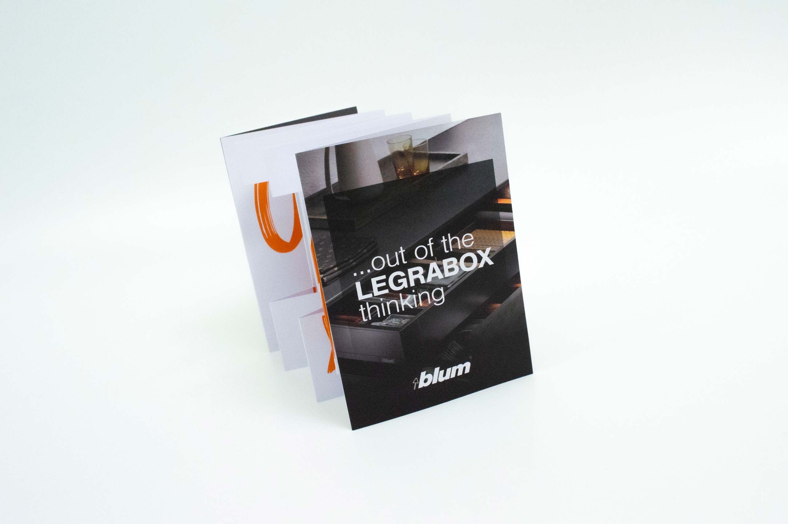
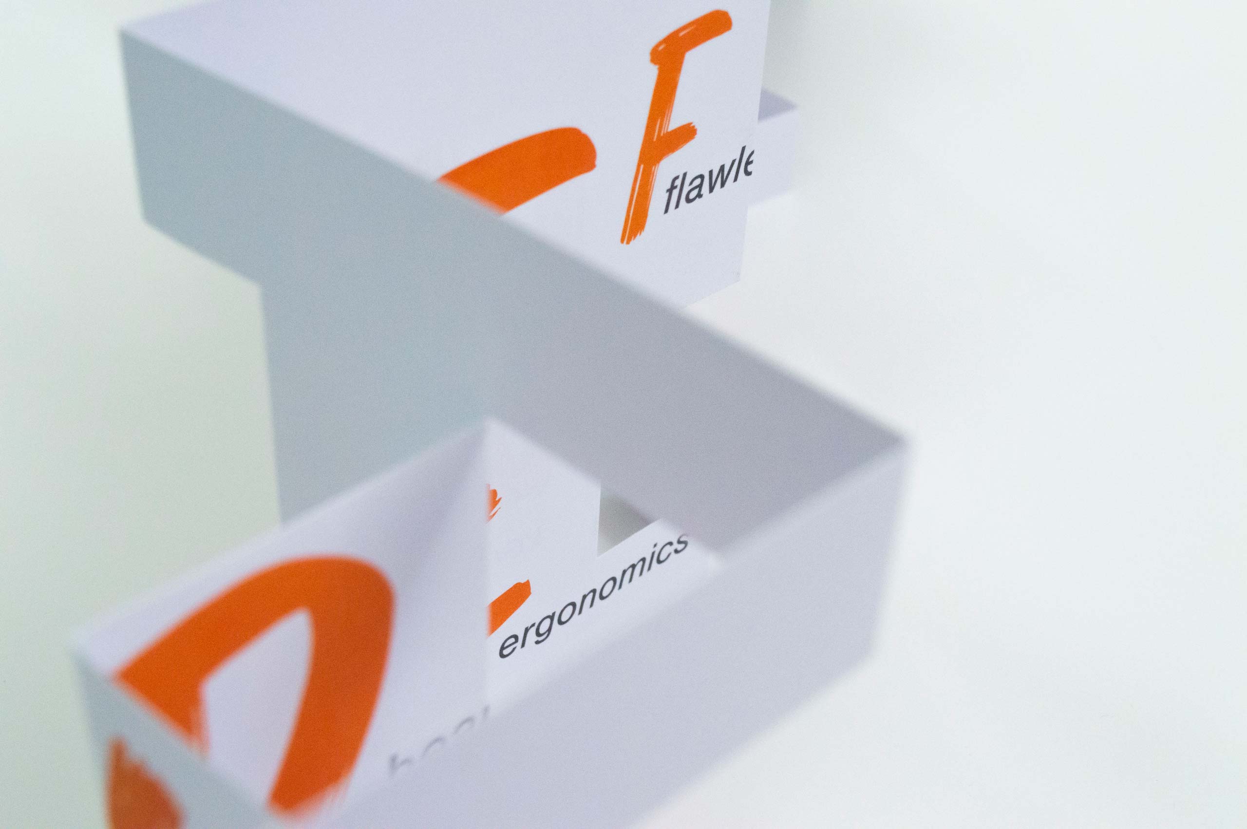
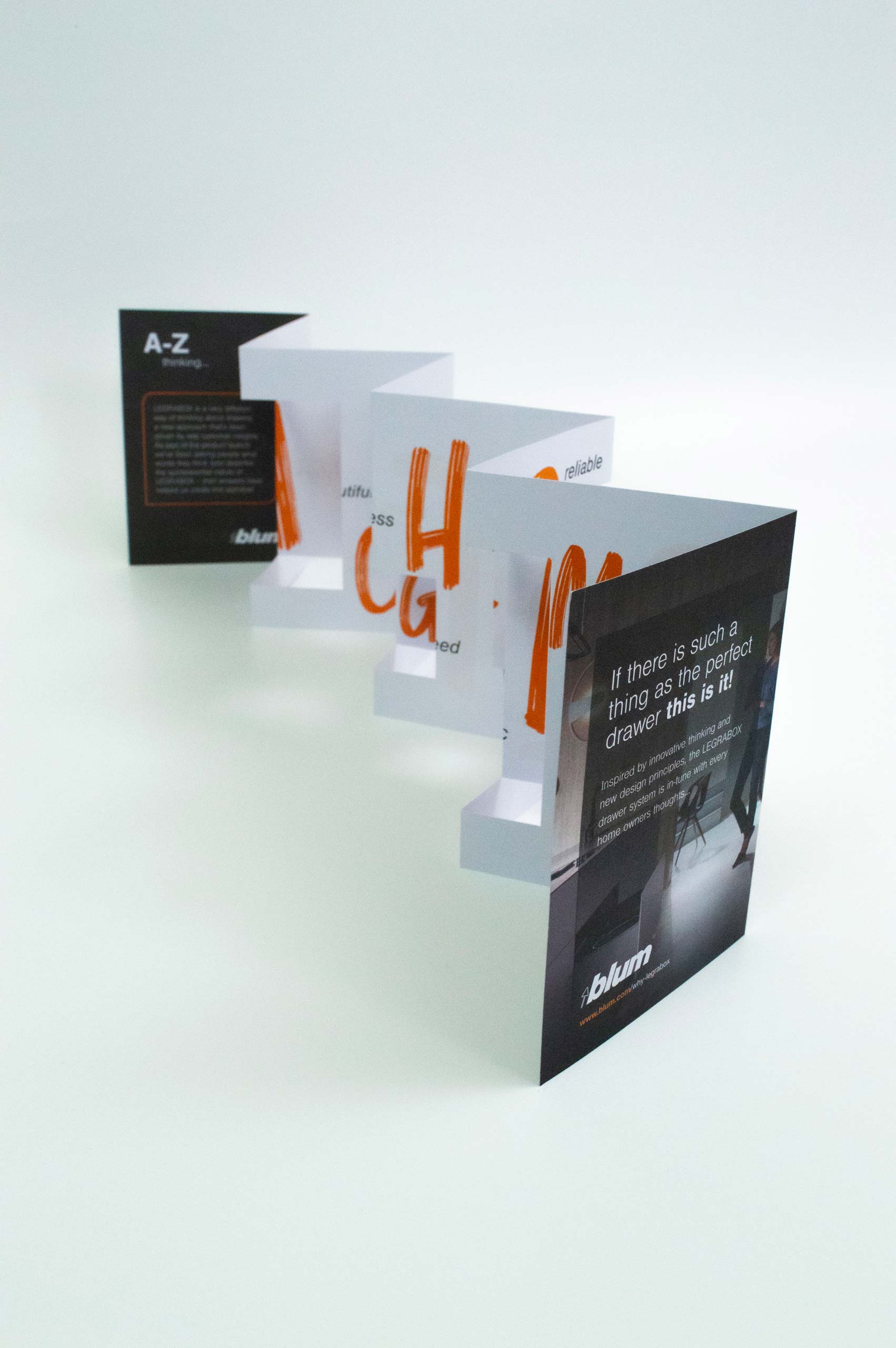
As part of the product launch the client had been asking people what words they thought best described the quintessential nature of Legrabox – their answers were collated and then used to help us create this tactile, pop-up alphabet. A double sided, concertina paper engineered solution was devised to quickly present all the letters for direct mail and point-of-sale purposes.
KEY SERVICES
- Messaging
- Art direction
- Design
- Print management
DELIVERABLES
- Brochure
- Direct mail and marketing collateral
- National advertising
- Point-of-sale
- Social media assets
Get in touch
Find out how we use kitchen brand marketing services to create effective brand experiences for our clients. Give us a call, drop us an email or just pop by our studio.

