The high-end brand lock-up
Well-designed identities often have different logo variations or lock-ups. A lock-up is the final form of a logo with all of it’s elements locked in their relative positions. For the sake of maintaining consistency in all mediums, the lock-up should not be taken apart or altered in any way. A good lock-up will create a sense of cohesion between the elements.
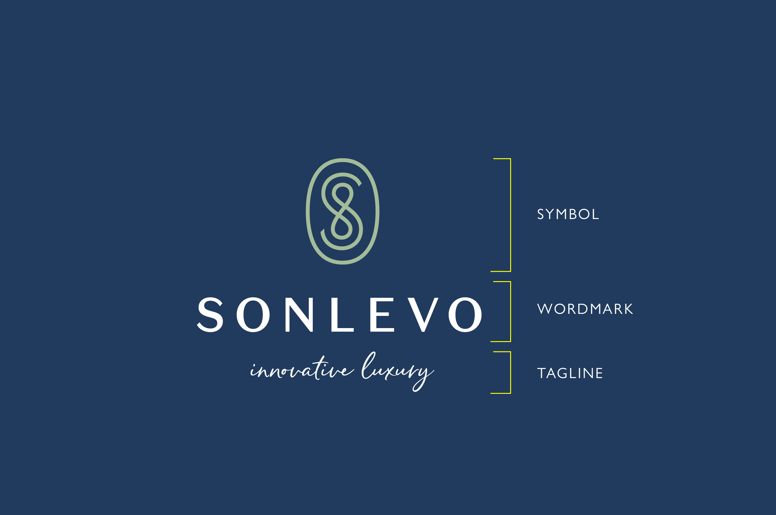
The Elements
Wordmark
is the brand name in a specific typeface or sometimes referred to as the font.
Symbol / Icon / Mark / Brand Mark / Logo
Is the component of the logotype that can either be used separate from the wordmark.
Tagline
The strapline, descriptor or promise line that may sit underneath the symbol and wordmark
The Lock-up
The lock-up is the formal combination of all logo elements together in a set position. Horizontal vs. vertical, short vs. tall vs. stacked, with and without symbols, with or without taglines. If the new logo is going to be used at small sizes, its important to consider looking at designing variants of the design for this purpose, which include less detail.
This has recently become a popular topic due to responsive web design, where smaller devices are becoming common place, however the same principles apply to print too.
Well-designed identities often have different logo variations or lock-ups.
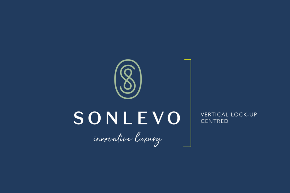
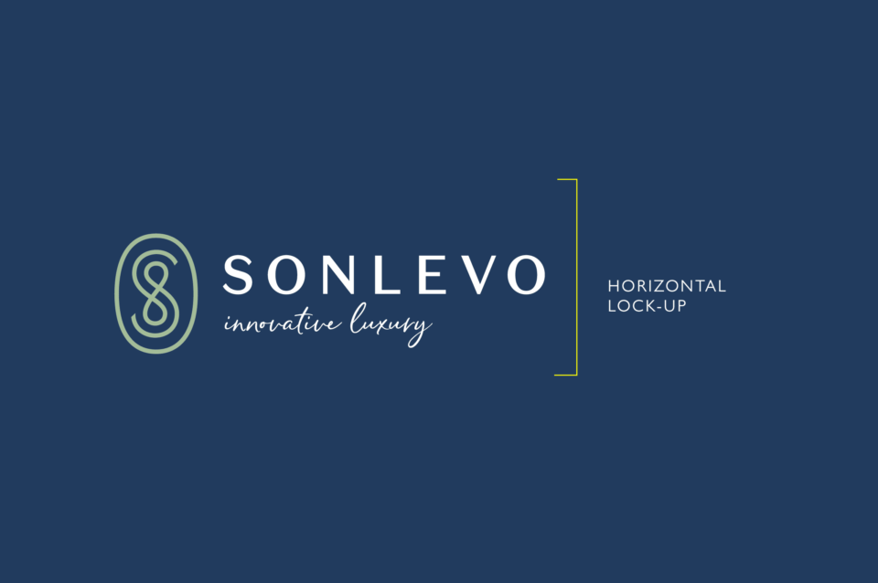
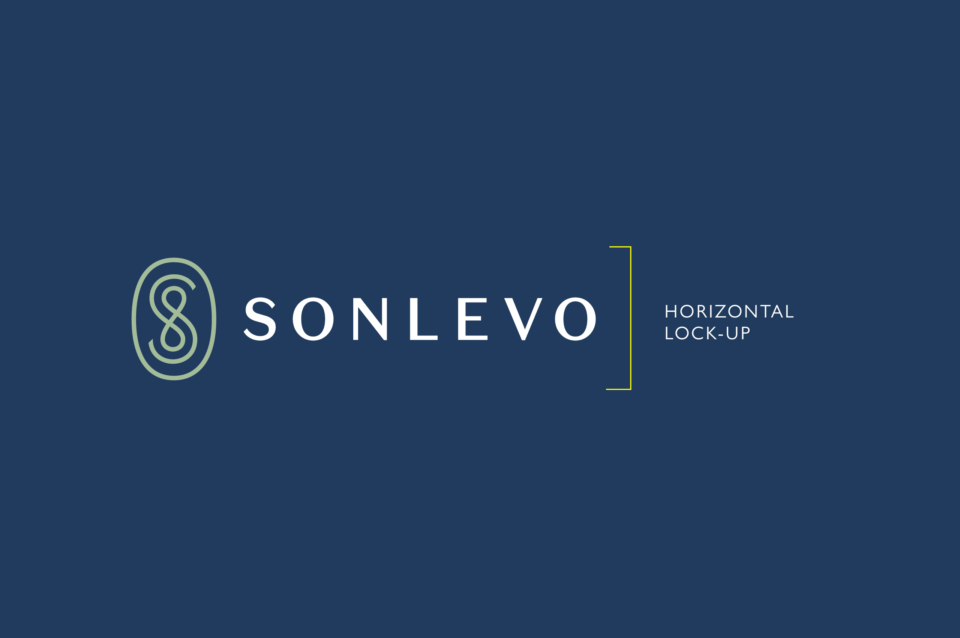
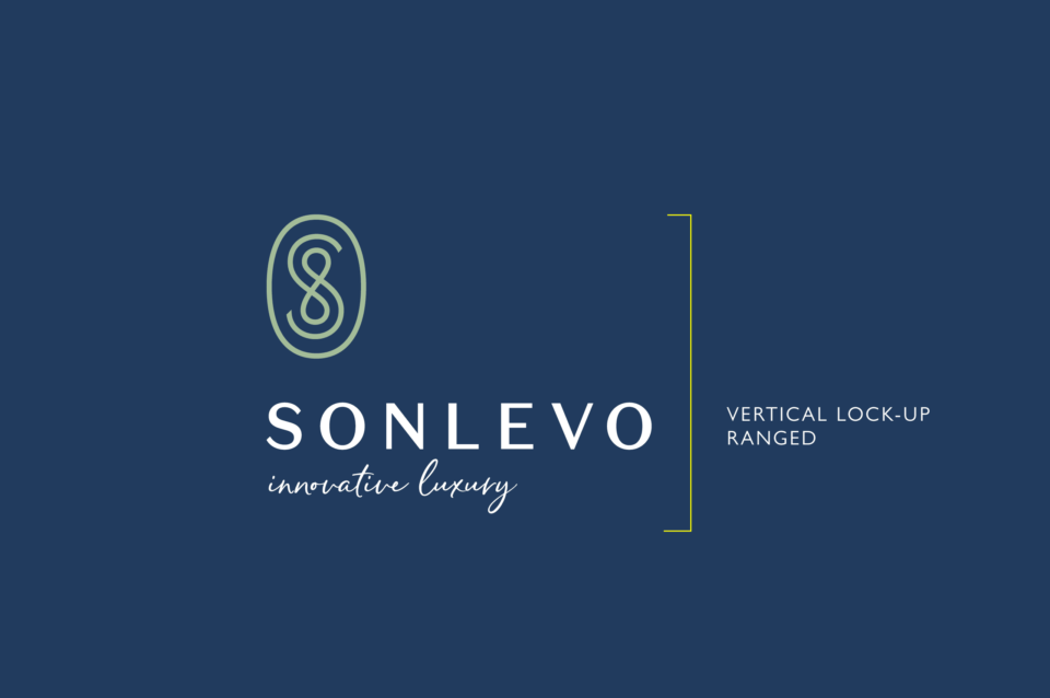
Examples in grid below: Sonlevo
- Vertcial-centred lock-up
- Horizontal-ranged lock-up
- Horizontal lock-up
- Simple horizontal lock-up
Detail Reduction
Logos and marks with intricate details are rare, but in these cases, reducing the level of detail can greatly enhance legibility at small sizes. Detailed shapes can be smoothed out, thin strokes can be made thicker, outlined elements could be inversed and filled in. For each reduced size of version of the logo, the level of detail is also gradually reduced, which greatly enhances the legibility of the mark at small sizes.
Example
Princess Yacht is a good example of having both a complex version (their metallic rendered lock-up) showing both crown symbol, wordmark and tagline “Crafted in Plymouth, England” and paring that back to a single flat colour version, that becomes simply the crown through various screen sizes in their responsive website

Example
Drummonds uses a standard centred-vertical lock-up with its promise tagline “Classic Handmade Quality” with interlocking ‘D’s above a serif Wordmark, the tagline disappears on the website header, and when scaled to a mobile screen the logo lock-up responds with the horizontal lock-up. It could have taken that one step further with the use of only the interlocking ‘D’ mark.
Working with Responsive logos
‘Responsive logos’ is a project that explores how brands might adapt for todays multiple devices and screen resolutions. By applying responsive design principles to individual elements of a logo, and stripping out detail in relation to screen size, a more legible and appropriate logo can be displayed. The concept aims to move branding away from fixed, rigid guidelines into a more flexible and contextual system.


Drummonds
Classic Luxury Bathrooms
Subscribe to our periodic updates if you are interested in or manage an architect, interior, or property brand.
NEWSLETTER SIGN-UP
Get in touch
Find out how we strengthen and develop your brand for your interior, furniture or property brand. Give us a call or get in touch.


